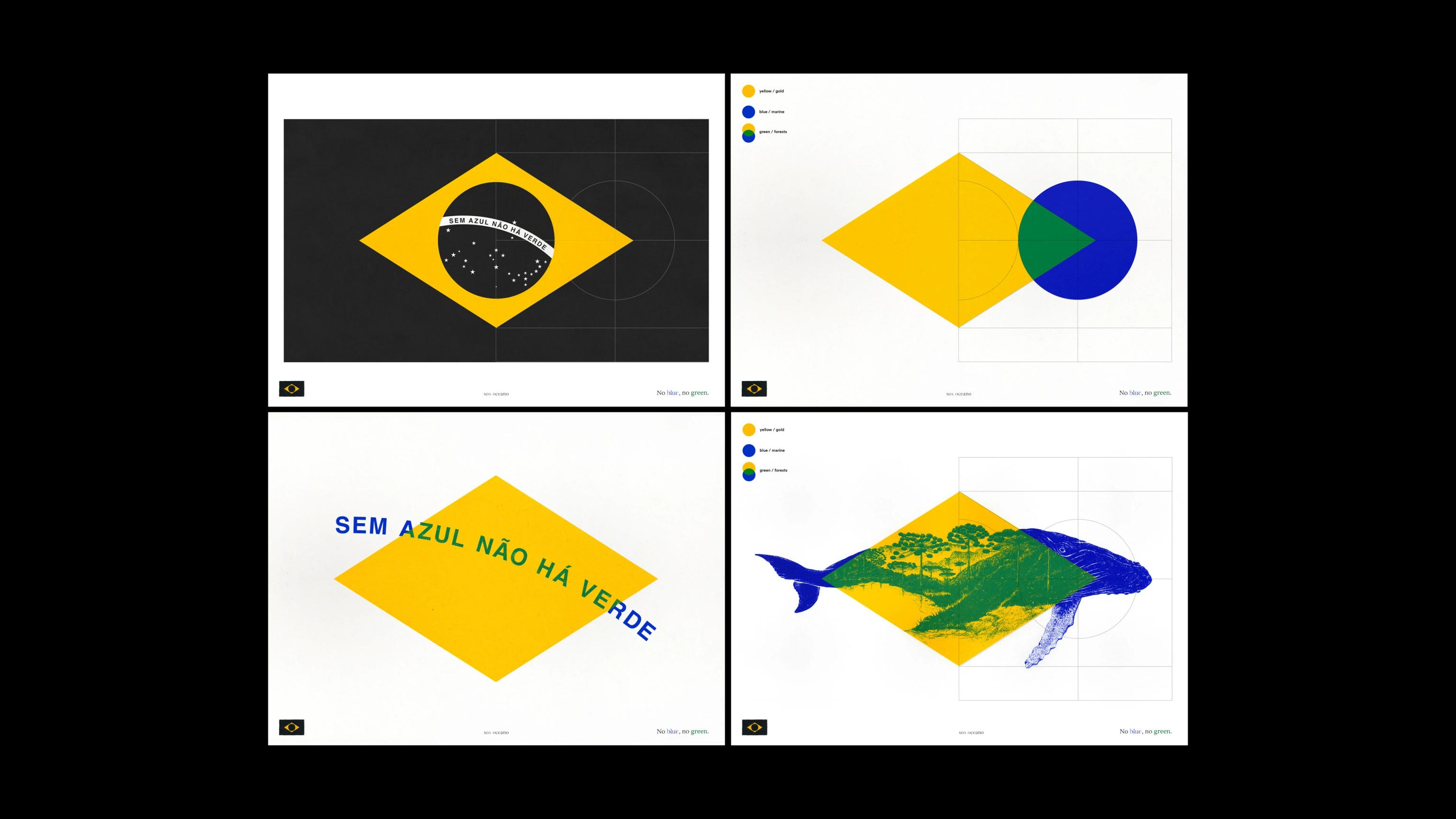

Droga5
SOS Oceano "No Blue, No Green"
- ClientSOS Oceano
- AgencyDroga5 São Paulo
- Chief Creative OfficerRafael Ziggy
- Chief Design OfficerDiego Limberti
- Executive Creative DirectorRenata Leão
- Creative DirectorLucas Antunes, Marcelo Diniz
- Design DirectorsCarlos Passos, Fábio Cristo, Marco Loschiavo, Rodrigo Bonfim
- Production CompanyBlack Madre
Juan Sebastián Moreno A reminder that traditional print techniques can still deliver powerful ideas. By removing a single ink color, the execution makes an environmental issue immediately visible, proving that the medium itself can become part of the message.


When a Flag Loses Its Colors, It Finds Its Voice
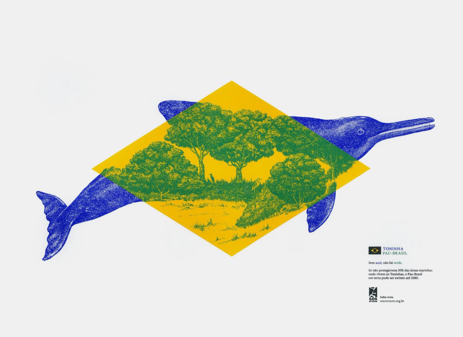
In October 2025, on the eve of Rio Ocean Week, something unusual happened to the Brazilian flag. The blue and the green disappeared. What was left, hoisted between the Museum of Tomorrow and the Rio Art Museum, was a stripped, unfamiliar symbol: a national emblem turned into an environmental warning. This was the opening move of "No Blue, No Green," also known as "Lifeless Flag," a campaign created by Droga5 São Paulo for SOS Oceano, a coalition of NGOs pushing to expand Brazil's marine protected areas.
The idea behind the campaign rests on basic color theory. Green only exists because blue does. It is the meeting of blue and yellow that produces the color representing Brazil's forests, and by extension, life on land. Diego Limberti, Chief Design Officer at Droga5, has explained that this chromatic relationship is the whole message. Take away the ocean's blue, and the forest's green disappears with it. The absence in the flag was meant to function as an alert rather than a decoration, a visual gap the eye can't quite settle into.
From Subtraction to Craft
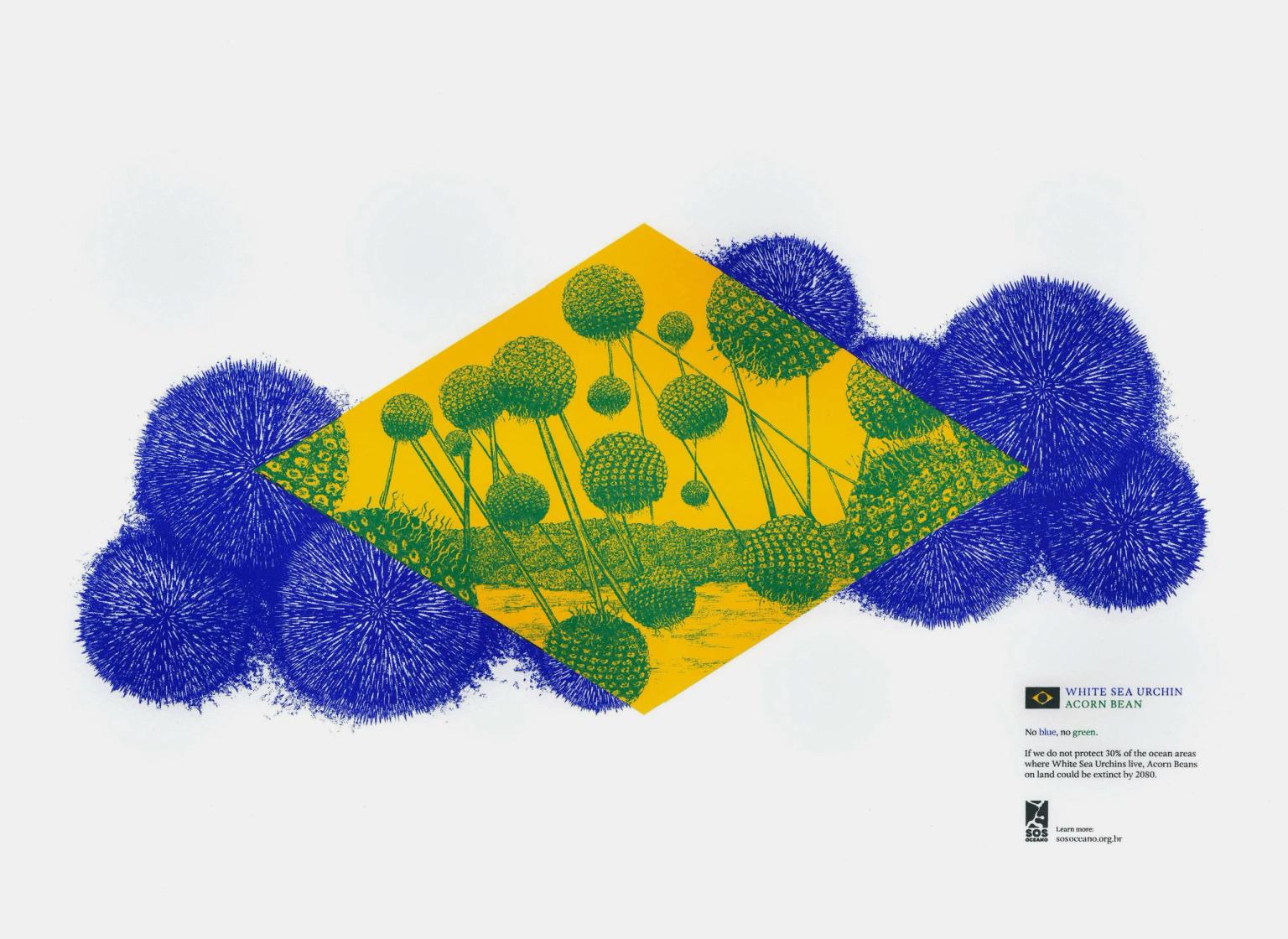
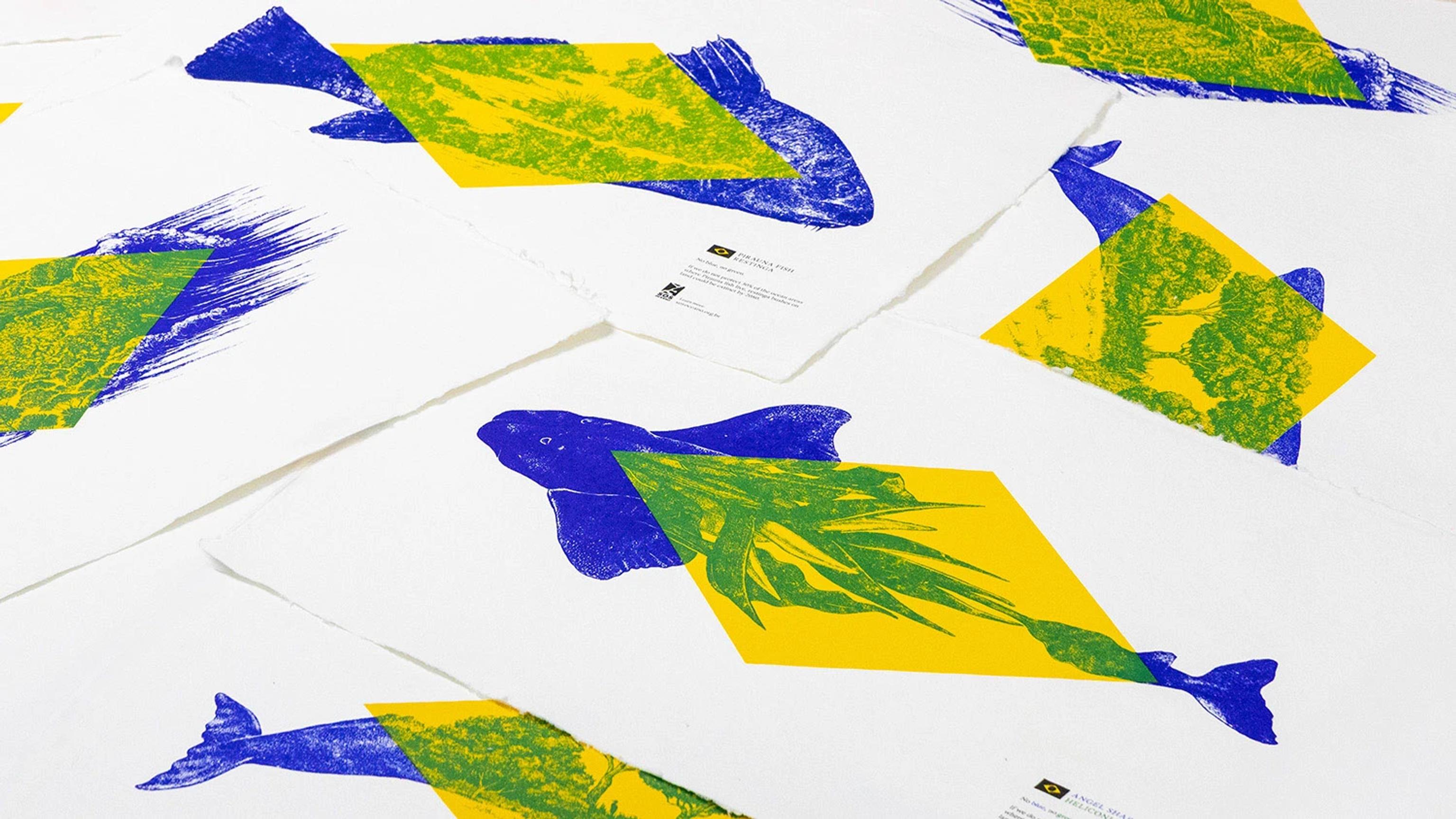
Phase one made its point through what was missing. Phase two, unveiled in March and April 2026, reversed the logic. Instead of removing color, Droga5 and design studio Black Madre reintroduced it, this time through the lens of Brazilian naturalist illustration. Six original screen printed artworks were produced using natural mineral pigments, developed in collaboration with Black Madre Studio and Joules & Joules Laboratory. Each print pairs a marine species with a terrestrial counterpart, from the Amazon rainforest to the humpback whale, arranged within the yellow diamond at the center of the flag.
Screen printing wasn't a stylistic afterthought. The technique was chosen for its chromatic precision and its ability to layer ink in a way that echoes the artisanal tradition of Brazilian graphic arts, tying the campaign's craft to its cultural roots. André Maciel, Creative Director at Black Madre Studio, has pointed out that the entire project is built on the basic logic of primary and secondary colors, the same idea a child learns with a paint set, repurposed here to explain something much larger about ecological interdependence.

Why the Ocean Needed a Louder Voice
The stakes behind the campaign are concrete. Brazil's coastline stretches more than 7,400 kilometers, yet its marine protected areas have faced mounting pressure from coastal development, industrial fishing, and shifting political priorities. Despite holding some of the richest biodiversity on the planet, Brazil's public awareness of ocean conservation lags well behind its awareness of Amazon deforestation, a gap the coalition behind SOS Oceano has been trying to close. Gabriela Rodrigues, Chief Impact Officer at Droga5, has spoken about the need to give ocean conservation the same cultural weight and voice that forest protection already commands.
Beyond the flag and the prints, the campaign extended into digital content, influencer partnerships, out of home placements, and bilingual activations aimed at an international audience, alongside a collaboration with the Sea Shepherd conservation group. Running through the buildup toward the global target of protecting 30 percent of the world's oceans by 2030, the campaign's ambition was never just to decorate a cause with clever design. It was to make an ecological argument so structurally embedded in a national symbol that the argument becomes almost impossible to unsee.