Explorers Club
Fred again.. USB002
- Creative DirectorExplorers Club – Aaron Skipper
- ScenographyBoris Acket
- ProductionAmelia Studios
- Executive ProducerJamie Glydon
- DirectorNatasha Duursma
- ProducerAlice Ellis
- Production ManagerChanel Parkinson
- CollaboratorsOpen Dialogue HQ
Hugo Mario García Moya You don’t always need a 60-second film. Sometimes you just need a button, a flag, and 20 seconds. I love how Fred again gets that. He’s more than a DJ/producer; he’s a whole creative universe: music, videos, performance, design, collabs, visuals… The USB concept itself is genius. Turning the music into an object you actually want to keep is such a good idea. And honestly, the video Fred used to promote it is even better.
The whole art direction of the tour is also worth a look.
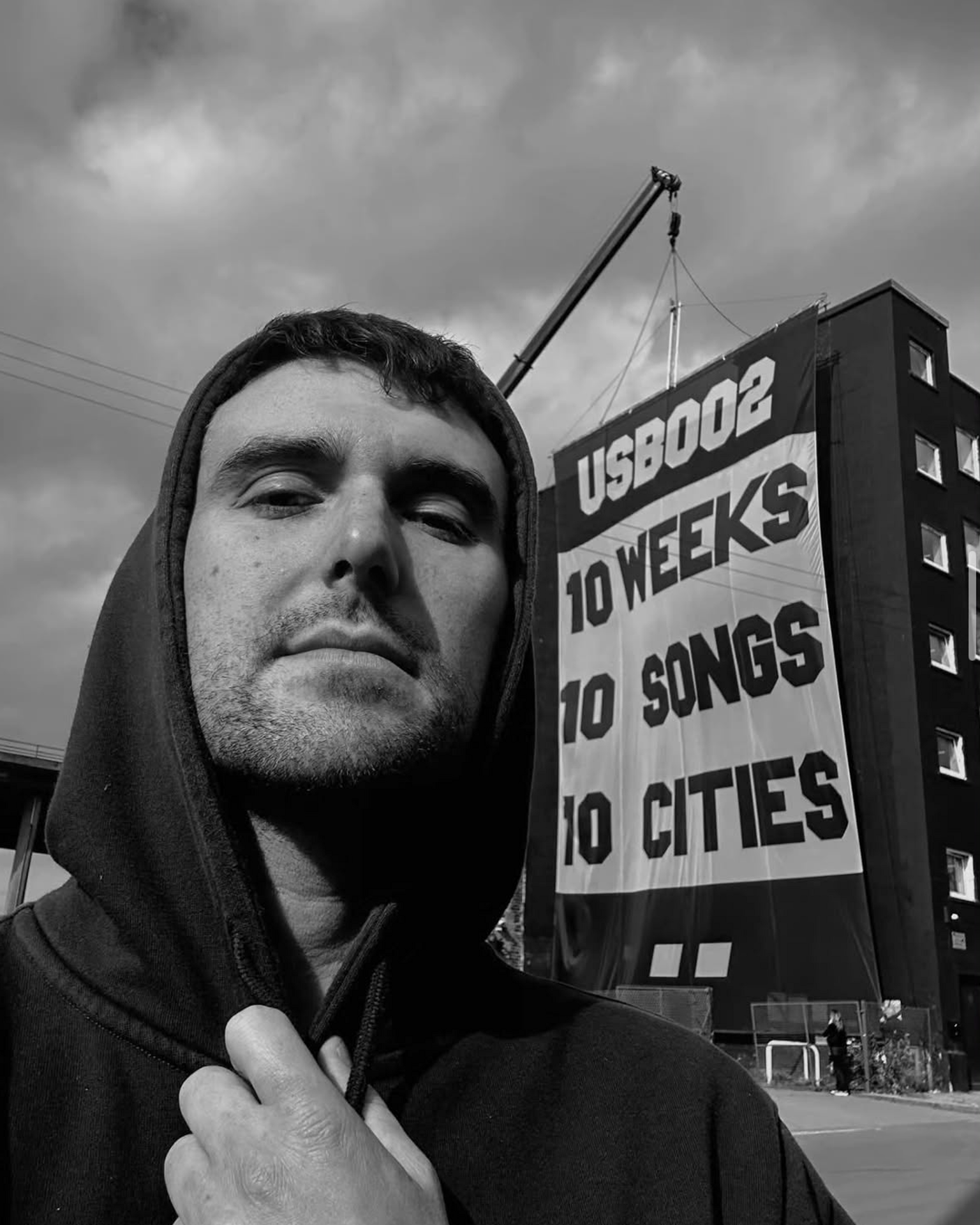

A Flag for a Global Moment
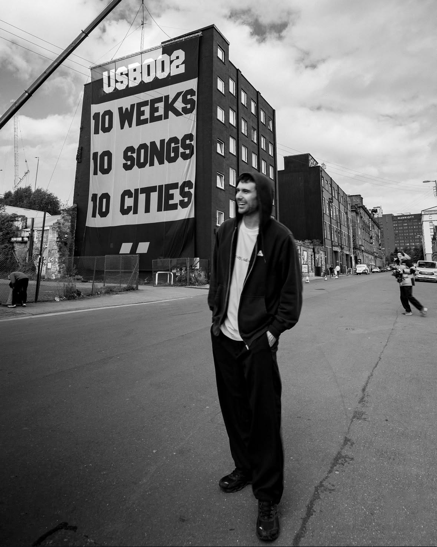
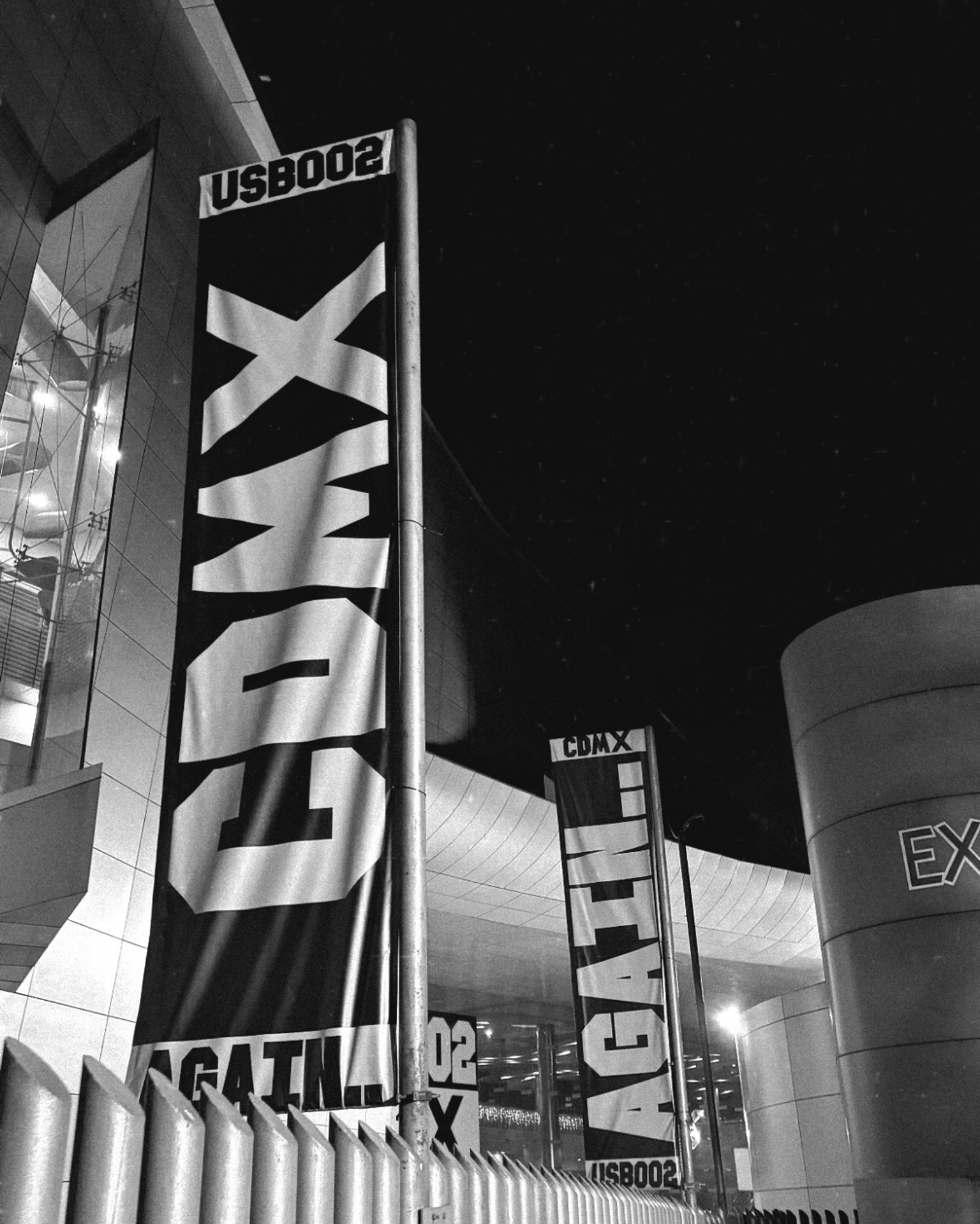
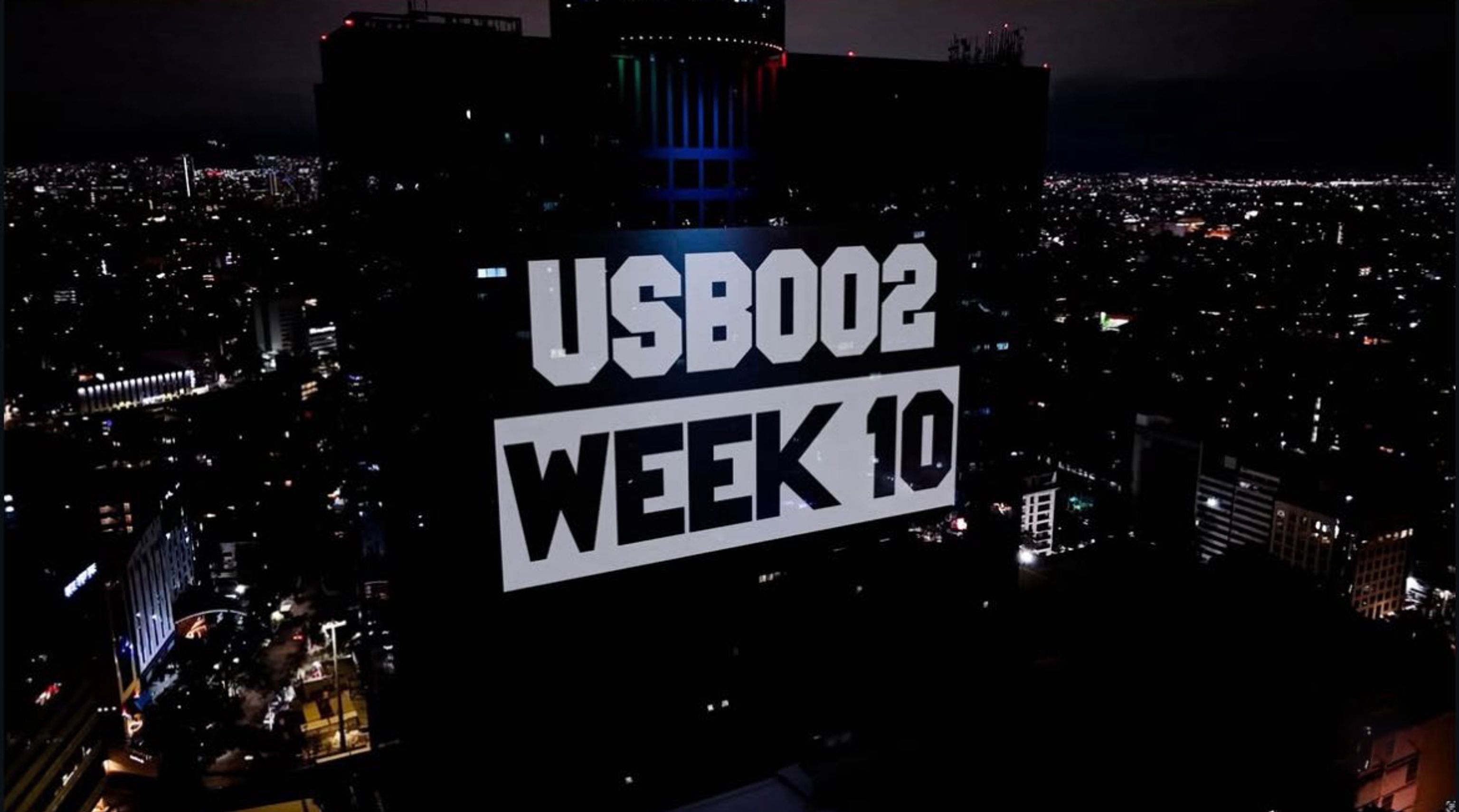
For Fred again..’s USB002 Tour, Explorers Club created a visual identity built around one deceptively simple idea: a flag. Rather than designing a different campaign for every city, the London- and Los Angeles-based strategy and design studio developed a system that could travel, adapt and grow with the tour. The flag became the central visual marker of USB002, appearing across everything from large-scale venue installations and building wraps to screens, merchandise and social media. Fred again.., the British DJ and producer known for his emotionally driven electronic music and highly communal live shows, was taking USB002 across cities around the world, making a flexible visual language essential to the tour.
Designed to Travel
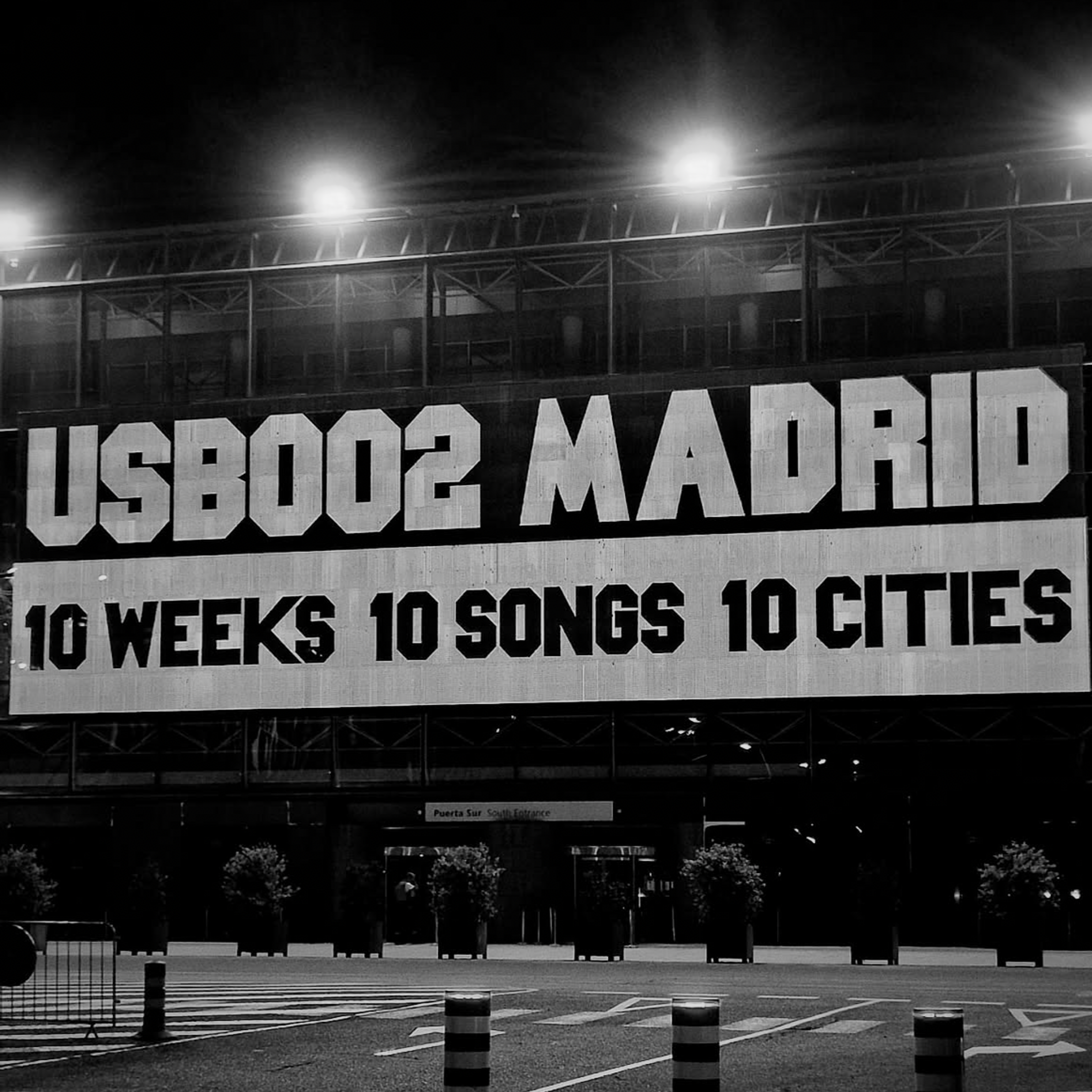
The tour unfolded across 10 cities over 10 weeks, with each stop introducing new music and a new chapter of the experience. The identity was therefore designed to be flexible without losing its recognisability. Its proportions remained constant while the applications changed from place to place, from a huge flag wrapping the entrance of Glasgow’s SEC Centre to large-scale screens in Madrid and an intervention on a historic cathedral facade in Lyon. Amelia Studios handled the production of the tour, while Explorers Club developed the visual identity, allowing the system to move seamlessly between different venues and formats.
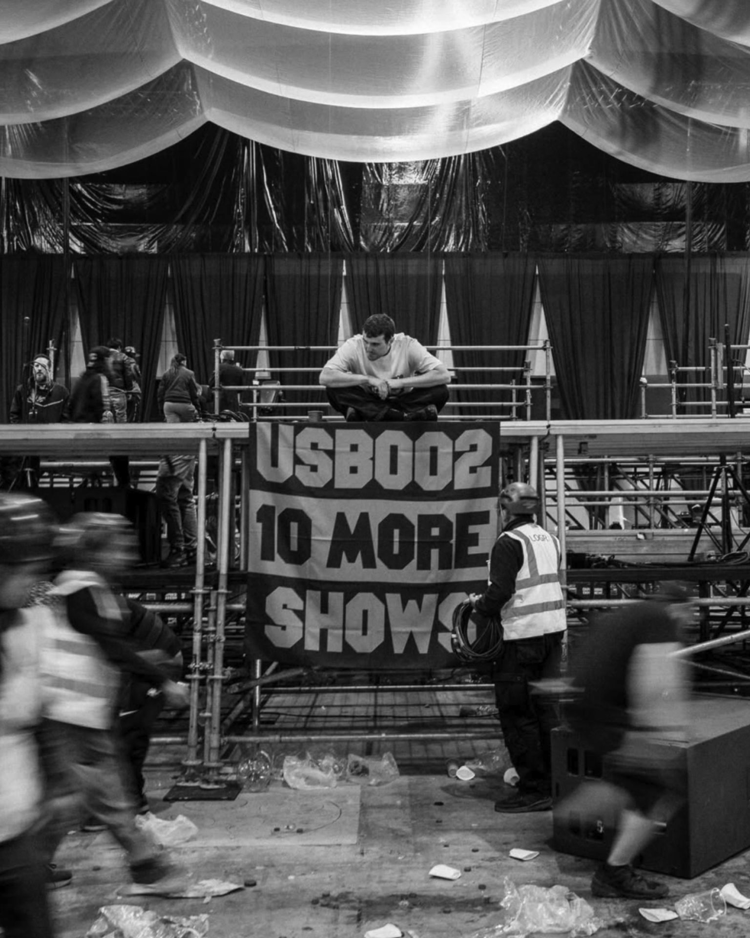

From Spectators to Participants
At the centre of the concept was the idea of togetherness and belonging. Explorers Club, led on the project by co-founder and creative director Aaron Skipper, deliberately kept the visual language minimal, believing that simplicity could give the audience more space to participate. The flag was not intended to be something fans simply looked at, but something they could photograph, share, reinterpret and make their own. Soon after the first show, images of the flag began appearing across social media, turning the design into a recognisable symbol of the tour and its community.
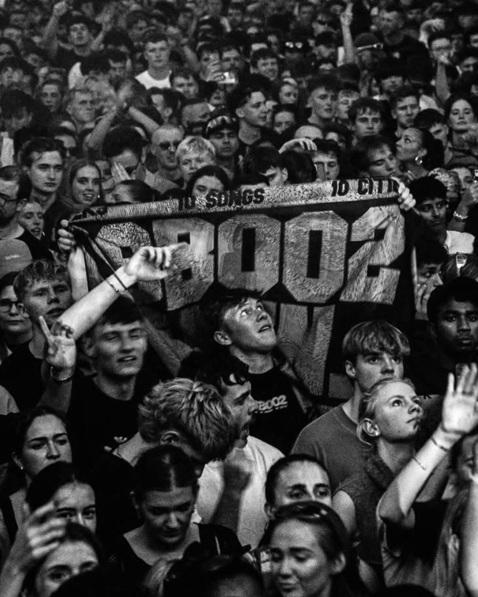

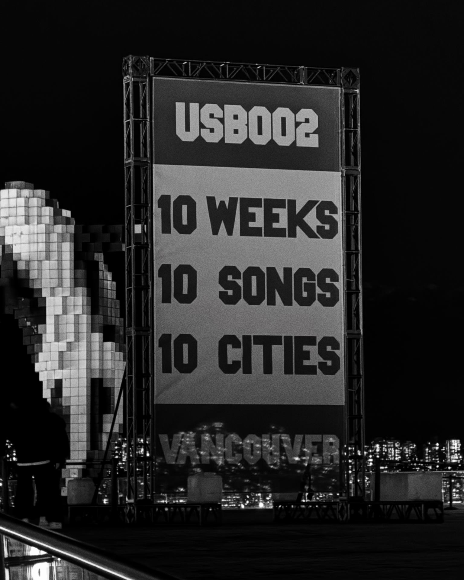

Analogue, Raw, Immediate
The identity also mirrors the raw and immediate quality of Fred again..’s music. Alongside the flag, Explorers Club developed a bespoke typeface inspired by hand-cut lettering and analogue craft, favouring instinct and rhythm over rigid graphic rules. The deliberately lo-fi, monochrome approach allowed the same visual language to work equally well at monumental scale and in the more intimate contexts of merchandise and digital media. The design was intended to feel tactile up close, while remaining instantly legible from a distance.
A Living Identity
Explorers Club’s approach reflects a broader understanding of what a tour identity can be: not simply a layer of graphics placed around an existing event, but something that can become part of the experience itself. The project was developed closely with Fred’s creative team, evolving alongside the shows rather than being treated as a finished system from the outset. With its combination of a strong central symbol and a flexible visual framework, USB002 became an identity shaped not only by the artist and designers, but by the people experiencing it, allowing the audience to carry the work beyond the venues and into the culture around the tour.